Tuesday, October 22, 2013
Sunday, October 20, 2013
Wednesday, October 16, 2013
Tuesday, October 15, 2013
Sunday, October 13, 2013
Friday, October 11, 2013

Wednesday, October 9, 2013
Tuesday, September 10, 2013
Monday, September 9, 2013
Sunday, September 8, 2013
Monday, September 2, 2013

Sunday, September 1, 2013
Tuesday, August 27, 2013


Wednesday, August 21, 2013
Monday, August 19, 2013
Thursday, August 15, 2013
Wednesday, August 14, 2013


Monday, August 12, 2013


Wednesday, May 22, 2013
Tuesday, April 30, 2013
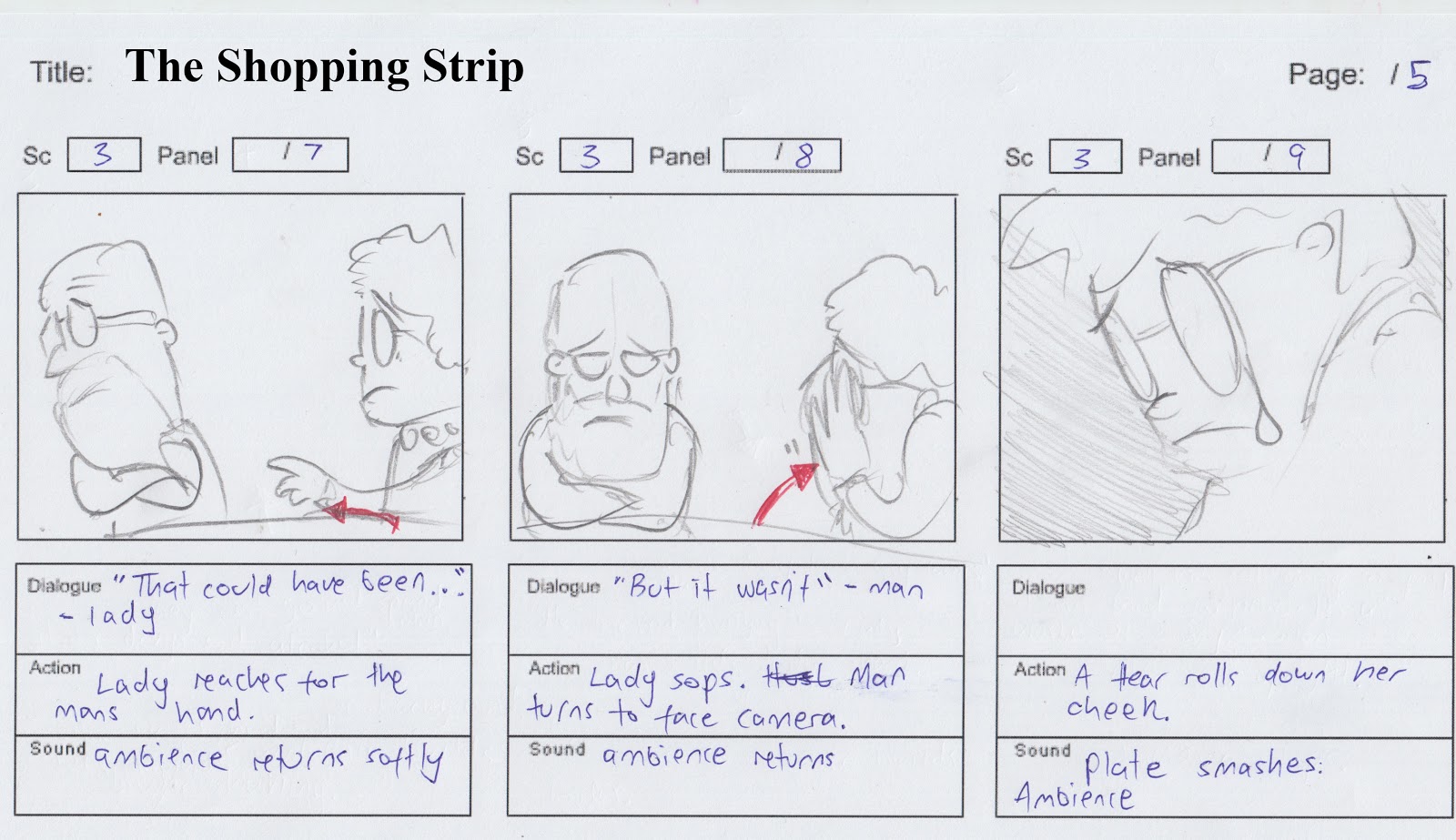
Story Board "The Shopping Strip"


Directors Statement:
The first shot mentioned within Script 1 is the market
place, a vessel for bargaining and trades. Our main
characters are quite old, and their slowness helps
juxtapose the swiftness and commotion of the world
around them. Visually I can pose the question to the
audience in the form of a hint; do our characters belong
here?
This is what has attracted me to the piece, as I feel
anything rich with multiple themes helps pave the way to a
more interesting and interpretive story.
Secondly, another driving force behind my choice of this
script is the ingenious use of the café as a set. Though is
it an interior shot, we can clearly see the exterior threw the
window, giving us two stages to work with simultaneously.
Two worlds coexisting, or clashing together again help to
emphasize the theme that the realm of death has found
it’s way (or has been welcomed) into the realm of the
living, and our characters are caught somewhere inbetween.
We can play on the concept of two worlds further. The
lady longingly looks outside into the exterior world, where
the shadowy figure was present. The shadow,
symbolizing death, can help us to visually communicate
that the lady is tempted buy the realm of the dead.
Her husband’s angry reaction causes him to turn his back
on the realm of the dead (the exterior of the café.) He
never longingly looks outside, but rather looks away.
Already this gives me a lot of themes to work with
visually, and also allows me artistically to provoke the
audience with interpretive visuals.
Filled with sympathy, as we find out later on, the old lady
is drawn towards the shadowy figure. She offers the
creature coins. Due to the setting of the market place, we
can get a hint that some sort of bargain is being
conducted between the two. Further down the track, the
audience is presented with the imagery of a bill, or receipt.
Symbolizing that a transaction, or exchange of services
has indeed been processed.
The old man interrupts the two after payment is
exchanged. The old mans hand that grabs his wife’s is
juxtaposed by the shadows hand. Both characters
seemingly creating a tug of war for the same prize.
After the exchange of dialogue within the cafe, the Lady’s
tear transforms into a fallen petal, which we use as a
symbol of death or dying. As the shadow appears in the
background, we can guess that the shadow and petal are
perhaps found only within the lady’s mind, as both
disappear.
Here we can emphasize both the play on multiple worlds
again, and also concentrate on the lady’s loneliness in her
plight. We ask the audience, “Can no one see what she
sees?”
Curiously all other people within the market place are
oblivious to the shadowy figured presence, walking threw
it on occasion.
Later the shadow takes the form of a child, lugging a toy
bear around with him. Watching on the outskirts from afar,
the shadow seemingly has a limited ability to interact
within the world of the living. The image of the bear serves
as a dummy for the shadow, showing that perhaps it too is
lonely, or ‘hungry’ for company. The dialogue “He looked
hungry” can help us add more light to this idea.
I wanted to create the idea that death is tempting the old
lady. Perhaps she has lost a loved one many years ago,
and longs to be reunited. Mixing the imagery of a child
and a scythe gives the shadow a lot more visual flavor. It
can be seen on one hand as a threat, something that
extinguishes life, and on the other, something loved and
lost that could be regained. This is the tempting bargain.
The man suggesting that the money offered would be
wasted on drugs and alcohol reveals a poor
understanding of what his wife is going threw, and helps
to illuminate her loneliness.
Her walking away from him at the market stand can
suggest her willingness to make a journey into the afterlife
alone, much to her husbands dismay. The rush and
hubbub of the market place can reflect the lady’s rush to
be released from life before her time.
In the final scene, as the shadow walks out of frame, we
allow the audience to hear coins jingling, as if to say that
the deal has been accepted.
The theme of death is applicable to a broad audience, and
is perhaps best suited for short animated film festivals,
since the story is small but full of imagery.
I would use both 3D (subtly) and 2D to animate the story,
again giving the audience hints about multiple worlds
through the use of different mediums.
Due to the heavy use of imagery and symbolism, the
piece would require a minimum amount of labor, as using
limited animation could effectively communicate the
themes and ideas of the piece.
Within the storyboard dialogue is organized largely off
screen, or through the use of long shots, freeing animators the work load of extensive lip synching. This
stage structure makes the piece more achievable and less
expensive to create, without losing any aesthetically
pleasing visuals.
Fitting the piece into the genre of drama/animation helps
to give the shadow a lessened threatening feel in key
shots. Where as I feel a live action shadow would be more
sinister, and lose its duality of symbolism.
- Marcus Binge
Thursday, April 11, 2013


Friday, April 5, 2013
Nom Nom
A new short animation clip. We spent about 50 hours on it. Very pleases with our baby.
http://www.youtube.com/watch?v=JTx0OIK3dcE&feature=youtu.be
http://www.youtube.com/watch?v=JTx0OIK3dcE&feature=youtu.be
Friday, May 20, 2011
Friday, November 12, 2010
Advice from the industry
I emailed a digital artist, once I was referred to him through an old friend, showed him some pictures and asked for his advice. This was years ago, but what was said has always played around in my consciousness. It is sage advice for all students.
howdy Marcus.
I've been pretty lucky in my freelance in that most of my work has come from word of mouth and referrals from past employers or industry placements.
I do 3D animation, motiongraphics, flash programming & animation.
These skills go well together which means they all help each other in my projects, but it also means that I have a few different clients (some that support big jobs which require 3d and planning and others that require 2 hours of editing a flash banner).
This is useful because big jobs often clash in timeframe or have large gaps between them and smaller jobs can fill those spaces.
promotion.
Get yourself a website, business card and put links to your site where you can - start with your email signature.
Don't expect to walk into a good 3d job without a folio of good experience.
It probably took me 3 years to build up my clients and job base to a decent position so don't think it will happen over night - that being said, I put no effort into "finding" work and simply let it find me, so it could be done alot quicker.
Don't fret about charging too little, especially when just starting out and you have no other jobs to do anyway, but understand that if you're working for someone cheaply, they're likely not to hang around when you up your rates.
Instead, what yo'd need to do is start charging newer clients more and once you have confidence in that client base, raise the others - if they drop off, so be it.
But the point is, it's better to have low paying work than no work to start.
How do you seperate yourself?
let me comment on the image your attached.
Interesting image, but don't make the mistake of students who come out of uni saying - I want to do 3d animation, I don't want to do advertising.
Design IS advertising. Art isn't... but artists are poor.
from that image, i can't tell what your design skills are like, which is important, I can only say that you like the abstract and you like cyborgs (like so many other 3d students)
Show some real world advertising skills.
Doesn't need to be complicated scenes, just stuff which says - I can put together a coles add with some text and a logo transition at the end..
But that's if you want to do motiongraphics in general. If you want to do straight 3D - it's impolrtant your show a good sense of timing and motion - but I've never pushed that as a single skill, so I can't comment much.
Are you looking for fulltime work or freelance work.
I'm not sure at what point one describes himself as having "cracked" the animation industry.
Any one of my clients could stop emplying me tomorrow if they don't have the jobs for me or if they hire someone fulltime.
this emails been a bit freeform thought, hope that's okay
Practical effects vs, CGI

Practical effects vs. Computer generated imagery
Originally 20th century fox asked Hill to direct Alien, to which he declined as the level of visual effects made him feel uncomfortable, and indeed the movie itself does require a massive amount of visual effects. With a budget of 8.4 million, Ridley relied solely on the use of practical effects to visually accommodate the movie, as computer generated imagery at this stage was still an emerging concept.
Ridley’s directors commentary on the movie uses the emergence of the face hugger as an example of how practical effects can achieve the same visual level of authenticity as CGI, requiring less funds and time. When Kane ventures out to investigate the distress signal coming from a derelict planet, he finds himself surrounded by eggs. The egg itself is crafted out of fibreglass, designed to be seen through when shone with a light. With hydraulics, mechanically the egg was able to open. Inside the egg Ridley used his own gloved hands to mimic that of the face hugger, which was designed to have long humanised fingers. The stomach of a cow was also used to give the content of the egg an organic feel.
For his exterior scenes of the spaceship, Ridley relied on the use of practical models and miniatures, which were crafted with amazing detail and used extensively throughout the film.
The Alien itself was played by design student; Bolaji Badej who with his slender lanky frame was chosen to fool the audience into thinking that no human was within the Alien costume, adding to the illusion that the creature had a life of its own. Bolaji Badej Was instructed to do tai chi classes to slow down his movement making for a more creepy approach.
Scott, accompanied by Swedish designer and concept artist Giger, are responsible for perhaps the most iconic monster of the last three decades, paving the foundation for countless spin offs, merchandise, video games and endless sequels, all without the aid of costly CGI.
To summarise, Ridley’s use of miniatures, meat products, puppetry and costumes were ingeniously crafted and executed to make Alien the pop culture classic it is today, 30 years on from it’s release. With a certain degree of smugness Ridley is often quoted commenting on the over use of CGI today. Arguably though as time moves on, one could nitpick the flaws of practical effects and the general animation of Ridley’s models, being moved on strings, couldn’t give an audience a real sense of weight, sapping the credibility of the giant space ship and massive refinery. Also Ridley voiced tension between he and his lighting crew who would often disagree on how to light the miniatures. Though lighting a computer generated 3d model is no less complicated, one could add that in the least the artist would have much more control.
Comparatively, one of the sequels “Alien resurrection” directed by Jean-Pierre Jeunet relied heavily on bringing the Xenomorph to life through computer generated imagery. With a budget of 70 million one could easily guess that the film relied heavily on the use of CGI to visually bring this movie to life.
The opening scene shows an extreme close up of a tiny fictional fly, which is obviously used to link the Aliens hive like mentality and behaviour to that of an insect. Already with the heavy use of CGI one can see how a lot of majestic allure that the Aliens had, which had been hinted at in previous films, was now being shirked in exchange for visual imagery and animation.
The first Alien only hinted towards the creatures links with insects like ants, and then elaborated in the following sequel ‘Aliens; which introduced the Queen. The origins of the Alien were shrouded in mystery, and the Alien itself was never shown in full, as the suspense and tension of the creature was crucial to the horror sci-fi genre. However it seems that when a massive budget, accompanied by CGI comes into the equation, directors find it all to tempting to really show off the monster, and it’s movement, almost spoon feeding an audience through a visual medium. Though this could arguably be quite warranted given that Alien resurrection is the 4th movie in the series, one could say that fans would beg for such visually stunning clips of Aliens swimming, and running down dark corridors, and would in turn be bored by being teased with only snippets of the creature.
Similarly, the ramifications behind the malfunctioning Jaws shark, forced director Steven Spielberg to imply it’s presence, rather than show it in great detail, as the robot shark itself wasn’t convincing. This worked to the movies advantage as by teasing the audience a massive amount of suspense was created. Alien resurrection seems to exchange suspense for animation, and without the foundations of the Alien itself being coated in mystery, speculation and predisposed notion of terror by Scott, the film itself would fall flat into the abyss of meaningless monster films.
By comparing the two movies, one can see how the use of practical effects can drastically reduce budget and time, and that CGI though applicable to today’s audience does have the ability to give a character believable movement, but over showing the Alien requires a sacrifice in suspense and allure, taking from the audience their ability to imagine and speculate and project their own fears onto the seldom seen creature. The limitations of practical effects can force one to rely on other film making skills to help get the point across, while the seemingly ‘create anything’ attitude that comes hand in hand with CGI reveals a risk in which a director can patronise an audience, destroy suspense, and perhaps prevent the audience from using their imagination.
Bibliography:
"The Darkest Reaches: Nostromo and Alien Planet", The Beast Within: The Making of Alien.
“Ridley Scott (Director). (2003-12-02). Alien Quadrilogy. [DVD booklet]. Los Angeles, California: 20th Century Fox Home Entertainment, Inc.”
Tuesday, November 2, 2010


Typology issues


Z brush adds typology to make for a more complicate character, which in turns allows ones to sculpt forms in greater detail. Sadly though, it messes up my typology, so when I rig the character, it won't deform as it should.
Anyone know a way around this? Is my original typology incorrect?
Wednesday, October 27, 2010

Sunday, October 24, 2010

Friday, October 22, 2010
500 word review of Semester
500 word review of Semester:
Happy with the amount of work that was achieved this Semester, as well as guidance and hands on help received from teachers. Composting, Animating, Color correcting as well as advice on building networks were all appreciated, and without such words of wisdom I feel I would have been left in the dark regarding some crucial aspects of both the film making process, and getting people to see my film.
Publicity was a subject that simply had not dawned on me, and thanks to my teacher we were given opportunities to talk to industry professionals, received positive feedback and constructive criticism on our individual DVD covers and work. We were also shown how to construct a press kit, and without the subject, two years worth of animating would have been for naught, as film festivals tend to look over your art without the publicity aspect of it.
Constructing and maintaining a blog was beneficial as it encouraged me to continually put more hours into my project, as well as providing teachers with speedy updates of problems we had ran into during production. The blog also operated on a publicity level, as it helped establish a fan base, as well as providing opportunities for the older students to see what the younger students were up to.
It was good to see the teachers bind together to help out the animation students, with some even doing over time, or helping students out on their breaks. Stress levels were extremely high towards the final stages of production, but all flared tempers and panics were dealt with professionally.
A lot of work has been put into organizing the screening, and we have been awarded with good career opportunities with some industry names that hopefully will make it down to see the clips. The teachers encouraged both the Screen and the Animation students to combine powers in order to construct invitations, as well as combining networks, which will hopefully be fruitful.
Recommendations were good; such as being encouraged to get business cards and Dl cards to add a professional flare to interactions with possible networks.
Furthermore, getting help from other students was a god send, as the experience directing, and the bonus work load seem to be crucial within the world of animating. All the Students treated each other with a mutual respect, both on a humane level and an artistic one.
No one’s movie was unfairly criticized, and there were no in fights throughout the entire 3 year course. Rumors and gossip tended to be a problem towards the end of the year, with tensions running high, but I suppose that comes with any working atmosphere.
All Equipment was provided, and it was rare to have to wait for Microphones, or the sound library.
The new library was unreal, with plenty of rooms to be booked, as well as allowances for hiring movies. The animation DVDs and books are well stocked, and recommendations towards which books were best for which skill level were given frequently.
A big thanks to ALL of my teachers for helping me out throughout the course.
It was a shame to see that Toon Boom never made it onto the school computers, as I feel the course has mainly catered for Stop-motion and 3d. Extra production classes would have been beneficial, as well as practical and theoretical Acting classes would have been a great help in an Animation stage.
Tutorials should be played in class, with exercises to accompany them.
Future students should be familiarized (or reminded) of the current roles found within the Animation Industry, and they should be encouraged to select one to specialize in.
Future students should also be constantly encouraged to take an active part in other student’s productions, across all year levels. CONSTANTLY. More marks should be awarded for team work, as I felt students who had spent a bulk of their time helping others didn’t receive praise from the teachers often enough.
Social functions or camps should be organized as well; to boost confidence in communicating, directing, and networking, as well as increasing morale and bonding between the teachers and the students. Students were constantly encouraged to be brave and approach industry professionals, but many were too timid to do. The student body, and the skill and duration of the movies presented by Holmesglen’s’ students will be increased dramatically if all year levels are encouraged to interact.
Again a massive Thank you to all of the teachers, for all the overtime, advice, encouragement and patience, as well as the ability to collaborate.
Thursday, October 21, 2010

Monday, October 18, 2010

Sunday, October 17, 2010
Lil' bit of a critique

Feeling that computer generated realism was no longer accepted with a knee jerk reaction of approval, I opted for more stylised cartoony characters, which seem to be absent within the 3d world. Given the fact that a lot of Pixar’s characters begin to look the same, and other production companies follow its inspiration, everything begins to look somewhat similar. I exaggerated my characters to have enormous heads comparative to their bodies, giving them an infantile appearance. I think it worked well, allowing for the big expressive faces to convey what they were feeling to the audience, as well as equipping them with an innocence in a world that was quite dangerous, adding to the character vulnerabilities.
To compliment the visuals of the characters, I designed the world to be somewhat abstract in ways, wherein the Shepherd’s shack tits atop what looks like a giant gum ball world. Fences line the horizon in jaggard chaotic formations, and debris litter the ground. I didn’t want to design something that looked polished, and tidy, which is sadly what the industry seems to want, but rather I created a world that was ruggard, and believable, and at the same time; out of this world.
Drawing influence from Shane Acker’s 9; and the stitch punk genre I incorporated a nice textured heshen sack look to the Shepherd, both because it gave the character a peasant, poor man feel, and also as a tiny tribute to the short film.
As far as the story went, I always found it difficult to squeeze in some interesting plot points, as well as gags within such a tiny time frame, and with limited resources. But none the less, I feel I created a nice well rounded story.
In a way, I tried to incorporate some religious undertones in the piece, to give it a more complex back-story and to add a little bit of intrigue into the gaps, or parts of the story that aren’t told; such as “how did the monster lose his eyes?”
I tried to craft my characters out of opposing forces. The Sheppard must be both tender and strong. He must utilize traits central to the female, as well as the male. Character’s like reluctant prophets, cowardly fighters, sympathetic monsters, all of these creatures with opposing personality traits fascinated me. They build tension all on their own, because tension and contradiction are inherent within them, breeding obstacles both within the mind and the characters’ world, as well as any other who would dare cross their path.
Using a blind monster gave me interesting tension building opportunities, as the Monster can be allowed to creep incredibly close to the characters, but still there is a chance he might not have cottoned on to them. He was fearsome, and creepy, but I wanted the audience to feel sorry for him, to relate to the fact that he has no choice but to try and find food aimlessly. I used a talented voice actor to portray the monster, who used a bizarre mix of laughing and crying to accurately reveal the two sides to the monster, sympathetic and by making him a sympathetic villain, I gave some room for the audience to hate on the Shepherd a bit more, who would obnoxiously abuse his sheep in comical ways. The hook “He who fights monsters, should look to himself that he does not become a monster” was a hint towards who the real monster of the story is, throwing a nice twist into a generic “hero fights monster” story arc.
I got worried at certain stages that these little hints of character weren’t strong enough, but in hindsight I feel it’s good giving an audience the ability to be intrigued by little details, however hidden they are, to subconsciously soak up information and interpret the story as they see fit.

Friday, October 15, 2010

Thursday, October 14, 2010
Sheep throw

I've done multiple renders of the sheep throw, trying to match his lighting and color, but again having a lot of trouble.
I've copied the stats for the lights used in previous scenes, but again it doesn't seem to be matching up perfectly. Might have to adjust the color in post.
Tuesday, October 12, 2010


Subscribe to:
Posts (Atom)