I emailed a digital artist, once I was referred to him through an old friend, showed him some pictures and asked for his advice. This was years ago, but what was said has always played around in my consciousness. It is sage advice for all students.
howdy Marcus.
I've been pretty lucky in my freelance in that most of my work has come from word of mouth and referrals from past employers or industry placements.
I do 3D animation, motiongraphics, flash programming & animation.
These skills go well together which means they all help each other in my projects, but it also means that I have a few different clients (some that support big jobs which require 3d and planning and others that require 2 hours of editing a flash banner).
This is useful because big jobs often clash in timeframe or have large gaps between them and smaller jobs can fill those spaces.
promotion.
Get yourself a website, business card and put links to your site where you can - start with your email signature.
Don't expect to walk into a good 3d job without a folio of good experience.
It probably took me 3 years to build up my clients and job base to a decent position so don't think it will happen over night - that being said, I put no effort into "finding" work and simply let it find me, so it could be done alot quicker.
Don't fret about charging too little, especially when just starting out and you have no other jobs to do anyway, but understand that if you're working for someone cheaply, they're likely not to hang around when you up your rates.
Instead, what yo'd need to do is start charging newer clients more and once you have confidence in that client base, raise the others - if they drop off, so be it.
But the point is, it's better to have low paying work than no work to start.
How do you seperate yourself?
let me comment on the image your attached.
Interesting image, but don't make the mistake of students who come out of uni saying - I want to do 3d animation, I don't want to do advertising.
Design IS advertising. Art isn't... but artists are poor.
from that image, i can't tell what your design skills are like, which is important, I can only say that you like the abstract and you like cyborgs (like so many other 3d students)
Show some real world advertising skills.
Doesn't need to be complicated scenes, just stuff which says - I can put together a coles add with some text and a logo transition at the end..
But that's if you want to do motiongraphics in general. If you want to do straight 3D - it's impolrtant your show a good sense of timing and motion - but I've never pushed that as a single skill, so I can't comment much.
Are you looking for fulltime work or freelance work.
I'm not sure at what point one describes himself as having "cracked" the animation industry.
Any one of my clients could stop emplying me tomorrow if they don't have the jobs for me or if they hire someone fulltime.
this emails been a bit freeform thought, hope that's okay

Friday, November 12, 2010
Practical effects vs, CGI

Practical effects vs. Computer generated imagery
Originally 20th century fox asked Hill to direct Alien, to which he declined as the level of visual effects made him feel uncomfortable, and indeed the movie itself does require a massive amount of visual effects. With a budget of 8.4 million, Ridley relied solely on the use of practical effects to visually accommodate the movie, as computer generated imagery at this stage was still an emerging concept.
Ridley’s directors commentary on the movie uses the emergence of the face hugger as an example of how practical effects can achieve the same visual level of authenticity as CGI, requiring less funds and time. When Kane ventures out to investigate the distress signal coming from a derelict planet, he finds himself surrounded by eggs. The egg itself is crafted out of fibreglass, designed to be seen through when shone with a light. With hydraulics, mechanically the egg was able to open. Inside the egg Ridley used his own gloved hands to mimic that of the face hugger, which was designed to have long humanised fingers. The stomach of a cow was also used to give the content of the egg an organic feel.
For his exterior scenes of the spaceship, Ridley relied on the use of practical models and miniatures, which were crafted with amazing detail and used extensively throughout the film.
The Alien itself was played by design student; Bolaji Badej who with his slender lanky frame was chosen to fool the audience into thinking that no human was within the Alien costume, adding to the illusion that the creature had a life of its own. Bolaji Badej Was instructed to do tai chi classes to slow down his movement making for a more creepy approach.
Scott, accompanied by Swedish designer and concept artist Giger, are responsible for perhaps the most iconic monster of the last three decades, paving the foundation for countless spin offs, merchandise, video games and endless sequels, all without the aid of costly CGI.
To summarise, Ridley’s use of miniatures, meat products, puppetry and costumes were ingeniously crafted and executed to make Alien the pop culture classic it is today, 30 years on from it’s release. With a certain degree of smugness Ridley is often quoted commenting on the over use of CGI today. Arguably though as time moves on, one could nitpick the flaws of practical effects and the general animation of Ridley’s models, being moved on strings, couldn’t give an audience a real sense of weight, sapping the credibility of the giant space ship and massive refinery. Also Ridley voiced tension between he and his lighting crew who would often disagree on how to light the miniatures. Though lighting a computer generated 3d model is no less complicated, one could add that in the least the artist would have much more control.
Comparatively, one of the sequels “Alien resurrection” directed by Jean-Pierre Jeunet relied heavily on bringing the Xenomorph to life through computer generated imagery. With a budget of 70 million one could easily guess that the film relied heavily on the use of CGI to visually bring this movie to life.
The opening scene shows an extreme close up of a tiny fictional fly, which is obviously used to link the Aliens hive like mentality and behaviour to that of an insect. Already with the heavy use of CGI one can see how a lot of majestic allure that the Aliens had, which had been hinted at in previous films, was now being shirked in exchange for visual imagery and animation.
The first Alien only hinted towards the creatures links with insects like ants, and then elaborated in the following sequel ‘Aliens; which introduced the Queen. The origins of the Alien were shrouded in mystery, and the Alien itself was never shown in full, as the suspense and tension of the creature was crucial to the horror sci-fi genre. However it seems that when a massive budget, accompanied by CGI comes into the equation, directors find it all to tempting to really show off the monster, and it’s movement, almost spoon feeding an audience through a visual medium. Though this could arguably be quite warranted given that Alien resurrection is the 4th movie in the series, one could say that fans would beg for such visually stunning clips of Aliens swimming, and running down dark corridors, and would in turn be bored by being teased with only snippets of the creature.
Similarly, the ramifications behind the malfunctioning Jaws shark, forced director Steven Spielberg to imply it’s presence, rather than show it in great detail, as the robot shark itself wasn’t convincing. This worked to the movies advantage as by teasing the audience a massive amount of suspense was created. Alien resurrection seems to exchange suspense for animation, and without the foundations of the Alien itself being coated in mystery, speculation and predisposed notion of terror by Scott, the film itself would fall flat into the abyss of meaningless monster films.
By comparing the two movies, one can see how the use of practical effects can drastically reduce budget and time, and that CGI though applicable to today’s audience does have the ability to give a character believable movement, but over showing the Alien requires a sacrifice in suspense and allure, taking from the audience their ability to imagine and speculate and project their own fears onto the seldom seen creature. The limitations of practical effects can force one to rely on other film making skills to help get the point across, while the seemingly ‘create anything’ attitude that comes hand in hand with CGI reveals a risk in which a director can patronise an audience, destroy suspense, and perhaps prevent the audience from using their imagination.
Bibliography:
"The Darkest Reaches: Nostromo and Alien Planet", The Beast Within: The Making of Alien.
“Ridley Scott (Director). (2003-12-02). Alien Quadrilogy. [DVD booklet]. Los Angeles, California: 20th Century Fox Home Entertainment, Inc.”
Tuesday, November 2, 2010


Typology issues


Z brush adds typology to make for a more complicate character, which in turns allows ones to sculpt forms in greater detail. Sadly though, it messes up my typology, so when I rig the character, it won't deform as it should.
Anyone know a way around this? Is my original typology incorrect?
Wednesday, October 27, 2010

Sunday, October 24, 2010

Friday, October 22, 2010
500 word review of Semester
500 word review of Semester:
Happy with the amount of work that was achieved this Semester, as well as guidance and hands on help received from teachers. Composting, Animating, Color correcting as well as advice on building networks were all appreciated, and without such words of wisdom I feel I would have been left in the dark regarding some crucial aspects of both the film making process, and getting people to see my film.
Publicity was a subject that simply had not dawned on me, and thanks to my teacher we were given opportunities to talk to industry professionals, received positive feedback and constructive criticism on our individual DVD covers and work. We were also shown how to construct a press kit, and without the subject, two years worth of animating would have been for naught, as film festivals tend to look over your art without the publicity aspect of it.
Constructing and maintaining a blog was beneficial as it encouraged me to continually put more hours into my project, as well as providing teachers with speedy updates of problems we had ran into during production. The blog also operated on a publicity level, as it helped establish a fan base, as well as providing opportunities for the older students to see what the younger students were up to.
It was good to see the teachers bind together to help out the animation students, with some even doing over time, or helping students out on their breaks. Stress levels were extremely high towards the final stages of production, but all flared tempers and panics were dealt with professionally.
A lot of work has been put into organizing the screening, and we have been awarded with good career opportunities with some industry names that hopefully will make it down to see the clips. The teachers encouraged both the Screen and the Animation students to combine powers in order to construct invitations, as well as combining networks, which will hopefully be fruitful.
Recommendations were good; such as being encouraged to get business cards and Dl cards to add a professional flare to interactions with possible networks.
Furthermore, getting help from other students was a god send, as the experience directing, and the bonus work load seem to be crucial within the world of animating. All the Students treated each other with a mutual respect, both on a humane level and an artistic one.
No one’s movie was unfairly criticized, and there were no in fights throughout the entire 3 year course. Rumors and gossip tended to be a problem towards the end of the year, with tensions running high, but I suppose that comes with any working atmosphere.
All Equipment was provided, and it was rare to have to wait for Microphones, or the sound library.
The new library was unreal, with plenty of rooms to be booked, as well as allowances for hiring movies. The animation DVDs and books are well stocked, and recommendations towards which books were best for which skill level were given frequently.
A big thanks to ALL of my teachers for helping me out throughout the course.
It was a shame to see that Toon Boom never made it onto the school computers, as I feel the course has mainly catered for Stop-motion and 3d. Extra production classes would have been beneficial, as well as practical and theoretical Acting classes would have been a great help in an Animation stage.
Tutorials should be played in class, with exercises to accompany them.
Future students should be familiarized (or reminded) of the current roles found within the Animation Industry, and they should be encouraged to select one to specialize in.
Future students should also be constantly encouraged to take an active part in other student’s productions, across all year levels. CONSTANTLY. More marks should be awarded for team work, as I felt students who had spent a bulk of their time helping others didn’t receive praise from the teachers often enough.
Social functions or camps should be organized as well; to boost confidence in communicating, directing, and networking, as well as increasing morale and bonding between the teachers and the students. Students were constantly encouraged to be brave and approach industry professionals, but many were too timid to do. The student body, and the skill and duration of the movies presented by Holmesglen’s’ students will be increased dramatically if all year levels are encouraged to interact.
Again a massive Thank you to all of the teachers, for all the overtime, advice, encouragement and patience, as well as the ability to collaborate.
Thursday, October 21, 2010

Monday, October 18, 2010

Sunday, October 17, 2010
Lil' bit of a critique

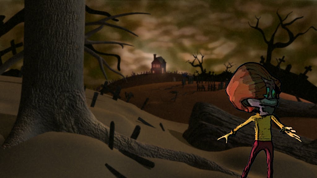
Feeling that computer generated realism was no longer accepted with a knee jerk reaction of approval, I opted for more stylised cartoony characters, which seem to be absent within the 3d world. Given the fact that a lot of Pixar’s characters begin to look the same, and other production companies follow its inspiration, everything begins to look somewhat similar. I exaggerated my characters to have enormous heads comparative to their bodies, giving them an infantile appearance. I think it worked well, allowing for the big expressive faces to convey what they were feeling to the audience, as well as equipping them with an innocence in a world that was quite dangerous, adding to the character vulnerabilities.
To compliment the visuals of the characters, I designed the world to be somewhat abstract in ways, wherein the Shepherd’s shack tits atop what looks like a giant gum ball world. Fences line the horizon in jaggard chaotic formations, and debris litter the ground. I didn’t want to design something that looked polished, and tidy, which is sadly what the industry seems to want, but rather I created a world that was ruggard, and believable, and at the same time; out of this world.
Drawing influence from Shane Acker’s 9; and the stitch punk genre I incorporated a nice textured heshen sack look to the Shepherd, both because it gave the character a peasant, poor man feel, and also as a tiny tribute to the short film.
As far as the story went, I always found it difficult to squeeze in some interesting plot points, as well as gags within such a tiny time frame, and with limited resources. But none the less, I feel I created a nice well rounded story.
In a way, I tried to incorporate some religious undertones in the piece, to give it a more complex back-story and to add a little bit of intrigue into the gaps, or parts of the story that aren’t told; such as “how did the monster lose his eyes?”
I tried to craft my characters out of opposing forces. The Sheppard must be both tender and strong. He must utilize traits central to the female, as well as the male. Character’s like reluctant prophets, cowardly fighters, sympathetic monsters, all of these creatures with opposing personality traits fascinated me. They build tension all on their own, because tension and contradiction are inherent within them, breeding obstacles both within the mind and the characters’ world, as well as any other who would dare cross their path.
Using a blind monster gave me interesting tension building opportunities, as the Monster can be allowed to creep incredibly close to the characters, but still there is a chance he might not have cottoned on to them. He was fearsome, and creepy, but I wanted the audience to feel sorry for him, to relate to the fact that he has no choice but to try and find food aimlessly. I used a talented voice actor to portray the monster, who used a bizarre mix of laughing and crying to accurately reveal the two sides to the monster, sympathetic and by making him a sympathetic villain, I gave some room for the audience to hate on the Shepherd a bit more, who would obnoxiously abuse his sheep in comical ways. The hook “He who fights monsters, should look to himself that he does not become a monster” was a hint towards who the real monster of the story is, throwing a nice twist into a generic “hero fights monster” story arc.
I got worried at certain stages that these little hints of character weren’t strong enough, but in hindsight I feel it’s good giving an audience the ability to be intrigued by little details, however hidden they are, to subconsciously soak up information and interpret the story as they see fit.

Friday, October 15, 2010

Thursday, October 14, 2010
Sheep throw

I've done multiple renders of the sheep throw, trying to match his lighting and color, but again having a lot of trouble.
I've copied the stats for the lights used in previous scenes, but again it doesn't seem to be matching up perfectly. Might have to adjust the color in post.
Tuesday, October 12, 2010


Monday, October 11, 2010

Sunday, October 10, 2010


Thursday, October 7, 2010

Friday, October 1, 2010


Thursday, September 30, 2010

Animatic
Here's a story board I worked on for Master Kavinda.
Lets hope he remembers the few hours I threw in.
Lets hope he remembers the few hours I threw in.
Critique of Shane Acker's 9
Critique 9:
9; the short computer animated student film, directed by Shane Acker (2005) evokes a visually amazing and intricate world, opening up revenues for curiosity within the audience. Though Tim Burton turned the short film into a feature and expanded on the universe of 9, Acker successfully paved the way for the creation of the world and story, utilising a terrifying obstacle, a quest for the hero to overcome, and a resolution to the film using ingenious story structure; all within the short duration of 11 minutes, as well as a lack of dialogue or narration to deliver such a feat.
Though arguably the short story is a feast for the eyes, with a beautifully told story, it is far more then a visual display of computer generated graphics. Acker successfully creates a high stakes plot, as well as developing deeper themes of which the audience can relate to.
The contention of this essay will argue that Acker’s 9 is a demonstration of successful use of story structure, as well as meeting criteria for successful film making, covering and expanding on facets such as character, obstacles, environments, themes and lighting.
This essay will critique both the visual aspects of Acker’s 9, as well as it’s use of story arc and structure, character development and design, lighting and environment.
After being introduced to the protagonists 5 and 9, the first element of the story that the audience is shown, is the world and environment the characters exist in. The world compared to our miniature hero’s is dark and post apocalyptic, riddled with discarded gems of debris and treasure, which the two characters cultivate for an unknown and intriguing purpose. The striking backdrops of the film, being shattered ruins of civilisation, are reminiscent of “Old photos from Chernobyl and bombed-out European cities during World War II.” When watching 9, the viewer can get a “sense of a fully developed world that’s just begging to be explored and fleshed out”
By making the props that the character collect enormous in size, dwarfing our hero’s, an audience is affected by these visuals in a simple sense, they can deduce two things: that the world is big and our heroes are small and vulnerable. Through the use of props, straight away the characters are given a vulnerability which adds to the tension of the films progression.
The lighting, being dim and eerie is also complimentary to this tension building aspect of the short film where in the green light coming forth from 5’s talisman, which warns the two of danger. Usually, red is commonly used as a symbol of immediate danger, micking the colour of blood and fire. Acker uses sophisticated facial expression and character acting to tell the audience that green is in fact representing a threat. This play on colour adds a new dimension to the film, as it is both unique in it’s delivery and also helps give a green monstrous glow to the scenery and characters, helping to show the audience that something ghastly, sickly green and monstrous is approaching. The green talisman become central to the plot shortly after, and begins to play symbolically by representing two things; both the character’s ‘soul’ and ‘danger’ given the different circumstances of the plots development. Using a symbol that comes to represent two things is tricky to pull off and commendable in this case, as if it were poorly executed the result would be confusing. “Containing powerful, thought-provoking science fiction themes.”
After gathering visual hints towards the theme of the film, the speculation that the audience is teased with opens up great avenues for questioning, and expanding on these themes. “The film is set during a near future in which humanity has been wiped out, a victim of destruction at the hands of the machines man himself created. “All that’s left of humanity resides within 9 tiny creations, man-made creatures that each carries with them a different piece of the human spirit.”
After 5 is killed, Acker uses the design of his monster, being entwined and draped in the slain characters clothing, to reveal two things to the audience, that the monster is killing the heroes of the story, that this threat has been around for quite some time, and that 9 the protagonist is directly in danger of being hunted down next. This adds a threatening, imminence to 9’s situation, ingeniously creating an obstacle for the character to overcome as well as building more tension, all through the use of visual design. “The monster seems almost perfect for the environment they come from, and the characters are very well emotionally presented considering their darned faces.” Again adding to the post apocalyptic nature of the short film, we can critique the 9’s design. “These 8-inch tall creatures, which Acker describes as "stitchpunk" beings, are pieced together from scraps of material, reflecting the desperation of the time.”
To deal with the threat, the items 9 collects in the start of the film, begin to be utilised again for the purpose of crafting a trap, tying up the loose ends neatly by explaining why in the beginning the two were harvesting junk, also satisfying the audiences curiosity in a timely and well executed manner. Further more, this also reveals to the audience 9’s central character traits, which helps paint the characters personality and development. Already we can deduce that he is cautious, patient, and very clever.
When the monster or antagonist falls for the bait, and is destroyed in the process, 9 collects his fallen comrades clothing and prepares them for ceremonial burning. After collecting the talisman, 9 watches in awe as the spirits of the fallen walk off to rest in peace, after receiving a nod of approval from 5. The concept of rest, and moving on to the after life, as well as being avenged allows the resolution of the story structure to come to a close, leaving 9 and the environment alive with a dabble of intrigue, which was obviously enough to spark the interest and creative of Tim Burton.
The rag doll design, with an interwoven wool texture has been mimicked and used within popular culture and games after 9’s release. Little big planet used a similar design, creating doll like creatures that had a similar texture attached to them and even had a zip similar to Acker’s characters. The woollen rag doll texture has also popped up in numerous animations and designs over the years, reinforcing the fact that 9 was innovative and contagious in its delivery and design.
To conclude, the visual aspects of 9 were original, dark, and refreshingly creepy. The characters’ design contributed both to their development as creatures within a believable world, and helped to deliver story elements visually. Colour and lighting was ingeniously used to symbolise multiple facets, allowing the audience to soak up different themes. Visually one could conclude that 9 was flawlessly beautiful, which is odd considering the world itself was post apocalyptic in design. Shattered buildings were complimented by soft lighting, mixing two contrasts together in a seamless and artistic fashion, “resented through faction fantasy pretty much existing as never-before-seen.”
“Despite its technical and artistic innovation’ however ‘perhaps Acker's emphasis on story will be what “9” is ultimately remembered for.” Often concerning the animated film world, it seems rare to find a balance between visual aesthetics and story, where in directors place emphasis on one or the other, rarely both. 9’s success I feel is largely due to the mastery of both these fields.
Wasting no time, the audience is hit with one tension packed plot point after the other, propelling our hero forwards against perilous odds. Acker has no need for lengthy shots that show off the modelling and texturing of his world, but rather wastes no time in feeding the audience a masterful build of tension and release. Each shot is filled with information, always contributing the stories development, and never overly glorifying, or rubbing the visuals into the audience’s faces.
Without dialogue, or narration Acker takes no easy path in telling his tale; portraying a “simple yet profound story telling without words, transcending past language barriers producing a universal story for all.”
“its clear why Tim Burton produced a feature film version since the film is full of possibilities.” One feat that can be attributed to 9, is that although it is fairly short in duration, the story found within each scene creates so much intrigue, with monsters, creatures and their origins so tempting to explore. Some of the best writers master the art of showing, not telling, and usually the greatest part of a story is not the part that is stated, but of all the thousands of possibilities and interpretation that a clever director can hatch within the viewers mind. “Acker also leaves much to our imagination, such as how the universe in 9 came to what it is now, a post-apocalyptic wasteland. The meaning of the ending, and the meaning or moral of the film itself, is also open to interpretation.”
To conclude Acker’s 9 is a demonstration of a beautifully and difficultly told story, matching Pixar’s high end standard of lighting, character movement and acting, as well as story arc. Creating multiple themes and symbols that come to represent so many different things simultaneously. By meeting criteria for successful film making, covering and expanding on facets such as character, obstacles, environments, themes and lighting, the greatest must redeeming quality of 9 is its originality and the intrigue it sparked in the viewers mind, who begs for more, and eventually got it.
Bibliography:
Lee, Rose Gypsy, Imdb Biography, " http://www.imdb.com/title/tt0443424/", n.d, http://imdb.com, (12 August 2010)
Avila, Michael (September 8, 2009). Film '9' May Set New Animation Standard. Newsarama. “http://www.newsarama.com/film/090908-9-director.html.” Retrieved (January 15, 2010)
Churchill, Steven. "Shane Acker discusses his award winning film '9'". AnimationTrip.com. http://www.animationtrip.com/item.php?id=742. Retrieved (January 15, 2010)
Amidi, Amid (February 9, 2007). "Shane Acker's 9". Cartoon Brew. http://www.cartoonbrew.com/cgi/shane-ackers-9. Retrieved (January 15, 2010.)
Focus Features (March 21, 2007). "Animated Epic 9 Sets All-Star Voice Cast". Press release. http://www.comingsoon.net/news/movienews.php?id=19457. Retrieved (January 15, 2010)
Wednesday, September 29, 2010
Playing around with colours is dangerous
Must stick to the colour scheme, but surely it couldn't hurt to mix up the colours just a tad? just a bit?

Promotional Art

I have always dug black and white images over colored for some reason.
On character sheets, I prefer it when the design his half way there, where you can see the artists scribbles and shapes and construction lines. Everyone in the industry likes polished art though it seems.


Tuesday, September 28, 2010
Early digital concept art

Here's an early version of the monster. He was somewhat mechanical, having a wind mill embedded into his head. He was rotting, and creepy, and suited the role of an evil antagonist, over a sympathetic monster. So he was scratched.
Friday, September 24, 2010

A fan base that cannot change

Even when producing a short story, I always felt the greatest writing technique was to allow the audience to speculate and imagine, to create a story and allow the watcher to fill in the gaps themselves.
One of my favourite teachers professed that his two favourite characters of all time were Darth Vader, and God. He was a Theological scholar, and had spent a great part of his life studying the literary side of both the Torah (the Jewish scripture) and the Bible.
The word bible, can be translated to mean “Many books” I further elaborate on this title, and perhaps controversially so, and state that the stories found in biblical scriptures are not so much dogma to follow blindly, but are merely interpretive, allowing the human mind to view the moral behind the story as they see fit, or applicable within their culture, society, or state of mind.
The bible simply put, deals with every facet of human existence. Eccelasties, rumoured to be King Solomon, wrote a lengthy chapter on depression. Wherein he claims that asking philosophical questions like “What happens after death?” and “What is my purpose” is the equivalent of “Chasing the wind.” Meaning you’re chasing something you cannot ever catch. He concludes by coining the phrase “Eat, Drink and be Merry” and the advice he game humanity, was to ‘Rejoice in youth.”
Another Chapter in the bible; “The song of songs” is a poetic song which celebrates two 16 year old lovers sneaking off to have sex. Pretty shocking, but none the less, it is apart of life which most can relate to, and though frowned upon in today’s modern day and age, one could interpret the act of love, and the innocence of the characters, as being intrinsically good.
The book of Job addresses the question “Why does it rain shit on good people?” And that always seems to be the case. I myself have had the pleasure of meeting some of the most corrupt, despicably evil and manipulative people in Melbourne, and at every turn they seem to be rewarded for their stealthy lack of regard for human growth. In the story, God eventually answers Job’s hopeless situation, by claiming that he is merely human, and his knowledge is limited. He simply can never know, nor understand the chaotic nature of the world.
The writers behind the bible were undoubtedly the greatest to ever have existed. Today we see lame bands that adopt a style of dress, sing about key lyrics, all in a bid to attract a demographic. The trouble with this is, for example, if an Emo band starts a fan base strictly full of an Emo subculture, and the media ends up hounding that stereotype (solely because it sells papers, I doubt they have any regard towards the key and crucial identity development of adolescents, one which they all had to face themselves ) The point being, the Emo bands demographic disappeared, evolved into another fast moving sub culture. The Alpha males and Females that were pulling the crowds got up and left, and all the lackeys followed them.
The writers behind the bible were far more advanced, as they backed a demographic that simply could not change. All humans have a sole biological purpose to breed, it is ingrained in our nature. We need to procreate, we need to love, we need to raise and nurture our children. This will never change so long as humans exist. Within the bible, almost every biblical hero wishes or asks God for many, many children . There are countless chapters which list the descents and bloodlines of significant characters. King David is succeeded by his son Solomon, and thousands of years down the track, the writers tell us that Jesus was of the same bloodline. Now here is the really clever part. Obviously when you breed, a portion of your genes and dna is passed on to your offspring. In a way, you are reincarnating yourself through your children. Though your consciousness dies with your body, your bloodline carries an element, or traits that were once you. In a way, you escape death.
And every human will always fear death.
The demographic was so firm and broad that these ancient texts have been best sellers for fucking thousands of years. Obviously given their success, or the success of their writing structures, other carnations of this scripture began to pop up. I am no historian, I cannot tell you which came first, or which deserves credit for originality if any, considering most of the tales found within holy texts are borrowed from Ancient Greek legends and mythology anyway.
Some writers were interested in the propagation of all living things. They took the elements of life that were constructive, and encouraged them. Some holy texts needed to back there own demographic, so they invested in writing that was interested in propagating a ‘chosen people.’
There were even some holy texts that not only backed a ‘chosen people’ but they also encouraged the death of their competitors. Not a lot has changed in marketing tactics, i’m afraid for every flaw we have in our nature, they’re will be two or three greedy, scheming, heartless bastards that seek to exploit for the sole purpose of making money.
What is interesting is the fact that a certain religion, which I fear naming due to reprisals, seems to be the first in history who don’t twist and turn the literary use of God into money, but rather mass destruction. They accumulate money, only to spend it on explosions. It is undeniably bad, but this break in human behaviour could be a sign of evolution perhaps? I don’t know, I still have alot to study. What I do know is, that overly passionate scripture is responsible for it.
You know the human race has failed somewhat magnificently when our technology completely dwarfs our morality. Anyone with a trigger finger can take a life sadly. Anyone with a tongue can sabotage, rumour monger and spread lies.
So if an age of terrorism, an age of murderous crusades, an age of holocausts and genocide, where greed and a love of money has always been around, and always will be. Where people will always lie. Where people will always wish destruction on any feasible target, wherein the power of their weapons has long since surpassed the power of their reasoning or coping mechanisms, who is to blame?
Has interpretation paved the way for a chaotic lack of regard for each other? Where older generations seek to exploit the young and naive, rather then nurture their talents and traits? Do we simply care more about making money, keeping our demographic stupid so they buy and believe our lie ridden marketing? Do we care about this more then Evolution?
I suppose you can find solace as a human being, that although evil and stupidity will always exist, one demographic, though minuscule in comparison, is the one that wants to see, and encourage the evolution of all species. Any dip shit can lie to someone, anyone with an index finger can destroy, every corporation wants a demographic that’s kept paralysed with fear, insecurity and stupidity. But only a select few Aplha’s can propagate the evolution of the mind.
I wanted to craft a film that mixed genres, that utilised Pixar’s duel audience of both adults and children, and ultimately encourage the viewer to interpret the clip into however they saw fit.
Ever seen Twilight? Ever notice how the female lead doesn’t actually act? She perpetually has a vague look of puzzlement on her face? That’s so every little girl watching her can see her as a blank canvas, and project their own thoughts and feelings into the empty vessel. It works.
You’ll find, if you don’t give people much information on who you are, or the way you think, or what you do, they’ll get dire curious about you. If you rarely talk or say a word, then eventually they’ll start to project themselves onto you, their flaws and failings. Things they hate about themselves, but cannot bare to face. I once had an actor tell me I was two faced, which I found interesting, as I had never had a conversation with him.
Thursday, September 23, 2010
Sheep shocked

“The shepherd drives the wolf from the sheep's throat, for which the sheep thanks the shepherd as his liberator, while the wolf denounces him for the same act as the destroyer of liberty.”
Wednesday, September 22, 2010
Foley
Foley List:
The bad thing about using free sound, is that they absolutely suck. Save for one website I stumbled across, which was dedicated solely to the sound of ‘havin a spew.’ Thousands of sounds, best described as a man heaving, then heavy thick liquid hitting the floor. Was grouse.
I need..
Snare sound effect.
Since the Shepherd has trouble loading the snare, it needs to be rickety. Some kind of springy sound, the sound of metal resisting weight. And finally a nice ‘click’ sound to tell the audience the snare is loaded. Perhaps a gun being cocked or loaded would fit this nicely.
Sheep sound.
I figured I’d try get my Sister’s 2 year old daughter to imitate the sound of a sheep. His character needs to be extremely cute, and using a recorded sound of a sheep ‘Baa’ doesn’t suit a humanized sheep well at all.
Monster. Since he is a sympathetic monster, i needed a deep whimpering to accompany his heavy footsteps, and snarls.
Bell:
The sheep’s bell is a huge story telling device. It clangs and bounces around. Any bell can help carry this effect, but it has to be accompanied by wood and grass. As the bell often bounces off wooden or earthy objects off camera. The bell also comes into contact with the monsters head, so a different sound would help here also.
Tuesday, September 21, 2010
Old school video Block
Here's an early early video block. The music is by Melbourne band "The Messengers" as was the only part of the project that was well received. I should have edited in the story board to help show the missing shots, but instead I used quick black outs, which in the film world is a big no no. Live and learn.
The feather at the start was a hint towards the Carrion Bird's.
Opening Titles third pass
There is a 6th pass floating around, but for some reason After effects spazs out when I feed it AVI.'s I'll beat it tonight for it's disobedience.
Sunset third pass
Ahh the sunset. Nothing says 'aesthetically pleasing to the eye' quite like a sunset.
The beauty of this being, if I reverse the frames, guess what I've got?
A nice return to the equilibrium is what.
Always having story structure in mind is a handy tool for either a hard working animation student, or a wanker.
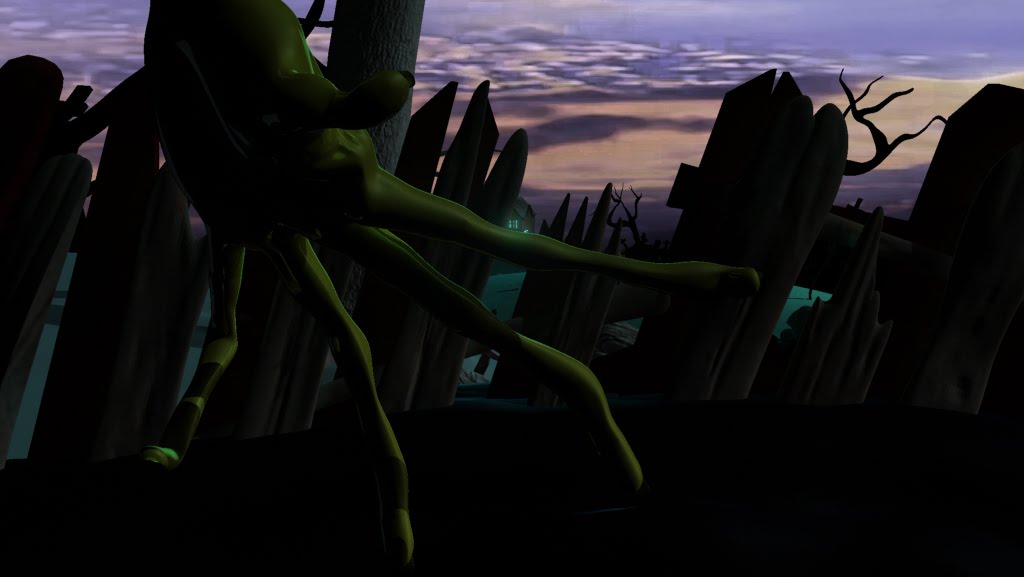
Carrion crawling bird

He's some more early concept art I dug up. Originally the carrion bird was to act like an Owl, which is often symbolically used in Film and Literature to show that every action taking place is being carefully observed.
The idea was that the Monster naturally preyed upon these birds, snatching them out of the air with his long slender fingers. When the monster's eyes were taken, and the blame strongly hinted towards the Shepherd as the culprit, the monster is forced to find easier prey. Thus the cycle of Karma returns to the evil Shepherd, as the monster begins stalking his sheep.
I wanted to put further emphasis on the theme of "An unbalanced Ecosystem" As when the monster is defeated, the birds are free to breed into plague proportions. The Shepherd, thinking the equilibrium of his world has been returned through the death of the antagonist, returns home to find the Carrion birds ceaselessly devouring his crops. With little to no choice left, the Shepherd is forced to eat his last precious lamb, and forever tormented by the act.
The story pokes fun at who the real monster is, thus allowing the monster to be both fearsome and sympathetic, and the Shepherd becomes both loving and cruel.
This story was rather dark, and I found the 3d style of the piece was better suited to something light heartened. But after being force fed a number of Disneyeske, kid friendly short films, which seem to dominate the 3d market, I began to think that backing something hideously dark and twisted would be well adapt at making it into film festivals.
The bird in itself however was way too complex for a student, and a limited team to pull off. Usually words like "plague proportions" can be translated into animation terms as accurately as "Fuckloads of endless work" or "Epic unrealistic goals."
Due to his ability to hop about on the ground, as well as fly, the character required an advanced rig, and considering we were already pushing 3 characters (the bird being the 4th) we sadly decided to axe him, as well as the theme of an Unbalanced Eco-System.
Probably the most frustrating thing about animation is having ideas, but not having the man power to pull them off.
Friday, September 17, 2010

Sunday, September 12, 2010


Thursday, September 9, 2010

Sunday, September 5, 2010
Freaking out
It's that time of year, panic chews away. 8 weeks left to have everything, EVERYTHING done. It's time to pray. Not to God, he will not heed my crys. But perhaps his incarnate son, Jack Parry will be able to sow some mircacles.


Saturday, September 4, 2010
Sheep animation fourth pass
Still floaty in some parts, but my confidence in the short clip is growing. Need to apply some jiggle deformity on the ears and body to give a bit more 'cuddliness' and believability to the Sheep.
Thursday, September 2, 2010
Sunday, August 29, 2010

Saturday, August 28, 2010

Friday, August 27, 2010
Facial blend shapes

Help! I need a alternate way to craft facial expressions! I cannot use blend shapes it seems, as My characters are already skinned, rigged and weighted. Let this be a lesson to all you noob animators out there.
Make your facial blend shapes BEFORE you rig your character! Now I'm either completely fucked, or I'll have to use whole body blend shapes. So it's either character animation without facial expressions, OR facial expressions without body movement.
Wednesday, August 25, 2010


Interior Shack, Sheppard thinks...
First pass, a bit floaty. Made the mistake of smoothing and relaxing the facial mesh, now I get horrible deformities whenever the Sheppard moves his head. I've tried masking the problem by using the Sheppard's hands to hide his horribly deformed face, as well as reduce head movements. Also thought about lighting the scene very dimly to hide any unsightly features, but so many 'short cuts' are making the scene close to unworkable, so I'll probably have to do it again.
Seems like every teacher I've had will constantly goad me to re-do things. If a character is slightly off, remodel it. Rig has some restrictions? re-rig. Not quite sure if they know the dead line, but i do.
Tis the trouble with working around perfectionists, but you cannot blame them, as their knowledge is something we must feed upon.
This is first pass. I may as well call this an advanced character block. SIGH
Saturday, August 21, 2010
Thursday, August 19, 2010


Subscribe to:
Posts (Atom)